
By: Evelyn H.
Color theory is more than memorizing color combinations. It’s about finding balance, telling a story, striking a chord. Having a solid grasp on color theory will advance your artwork into something that provokes conversation, something that is eye-catching and compelling.
Hi, I’m Evelyn. I’ve been studying traditional art for eight years, and digital art for four years. Color theory, to me, is one of the most intriguing and versatile aspects of art. This is because it can be applied to any facet of art you can imagine: background illustration, character design, lighting, composition, and even black-and-white art! In this article, I’ll walk you through the basics of color theory, and then how to apply what you’ve learned to your art through examples, tips, and tricks.
Starting With the Basics: Primary Colors
Before you can begin utilizing color theory, you have to learn the basics. It’s like riding a bike! Once you practice and learn how, you can’t forget. First things first, let’s review primary colors. Believe it or not, there are two different sets of primary colors, each of them used for different mediums.
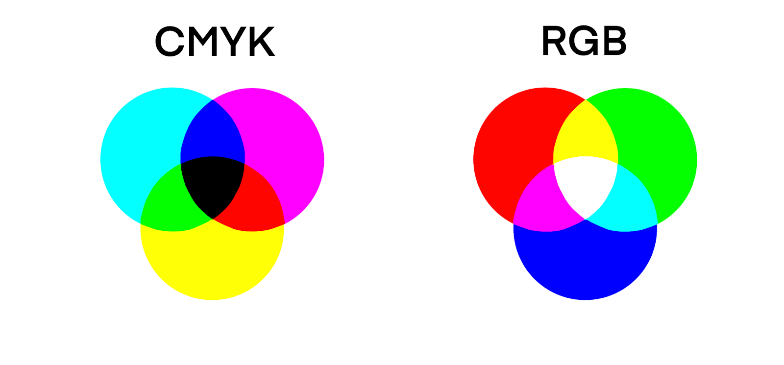
The first set of primary colors is cyan, magenta, and yellow (often abbreviated to CMY). This set of colors is used for traditional art, or art that isn’t digital. You might be thinking, “I thought red, yellow, and blue (RYB) were the primary colors?” But this is actually false! When it comes down to it, CMY blends much easier and produces much smoother colors than RYB. CMY is a subtractive, pigment-based color model, meaning that pigment is used to produce color using reflecting light. So, if we mixed all those pigments together, we would get black. This makes sense, because all traditional art is made with reflecting light–that’s how we see things! For example, when you look at a red apple, your eyes are only picking up the light waves that the apple reflects. The apple is absorbing every other light wave, while the red light wave bounces off the apple and into our eyes.
CMY is also used in ink cartridges for printers, since ink is a traditional medium. Another abbreviation for cyan, magenta, and yellow is CMYK. This is how ink cartridges are labeled. The “K” represents black ink, because if we used “B,” that would stand for “blue.” The actual letter “K” in CMYK is an abbreviation for “key,” or “key plate.” This is an older term print shops would use to describe the printing plate with the most detail, and almost always, this plate was used for the color black. I won’t get into the details of printing plates here–that would require an entire other article–but if you’re curious, I highly recommend you look it up!
The second set of primary colors is red, green, and blue (abbreviated to RGB). This set of colors is used in digital artwork done on computers. This might seem like a strange color combination, but it is the most efficient when you’re working with light instead of pigments. RBG is an additive, light-based color model, meaning that light is projected straight through the screen without reflecting off anything. If we mixed each of these light waves together, we would get the color white!
Okay, now that we’ve got an understanding of our primary colors, let’s take a look at how to use them! For the sake of simplicity, let’s use CMYK in our practice. This will work for both digital and traditional art, don’t worry! Most, if not all digital art programs are set up to allow for color interactions in RGB to be translated into CMYK when presented on the screen. Please don’t mess with the settings on your digital art program unless you are absolutely sure that the changes you make will work the way you expect them to!
Since we’ve covered primary colors, let’s see how they interact and mix to make secondary colors! Here are our primary colors:
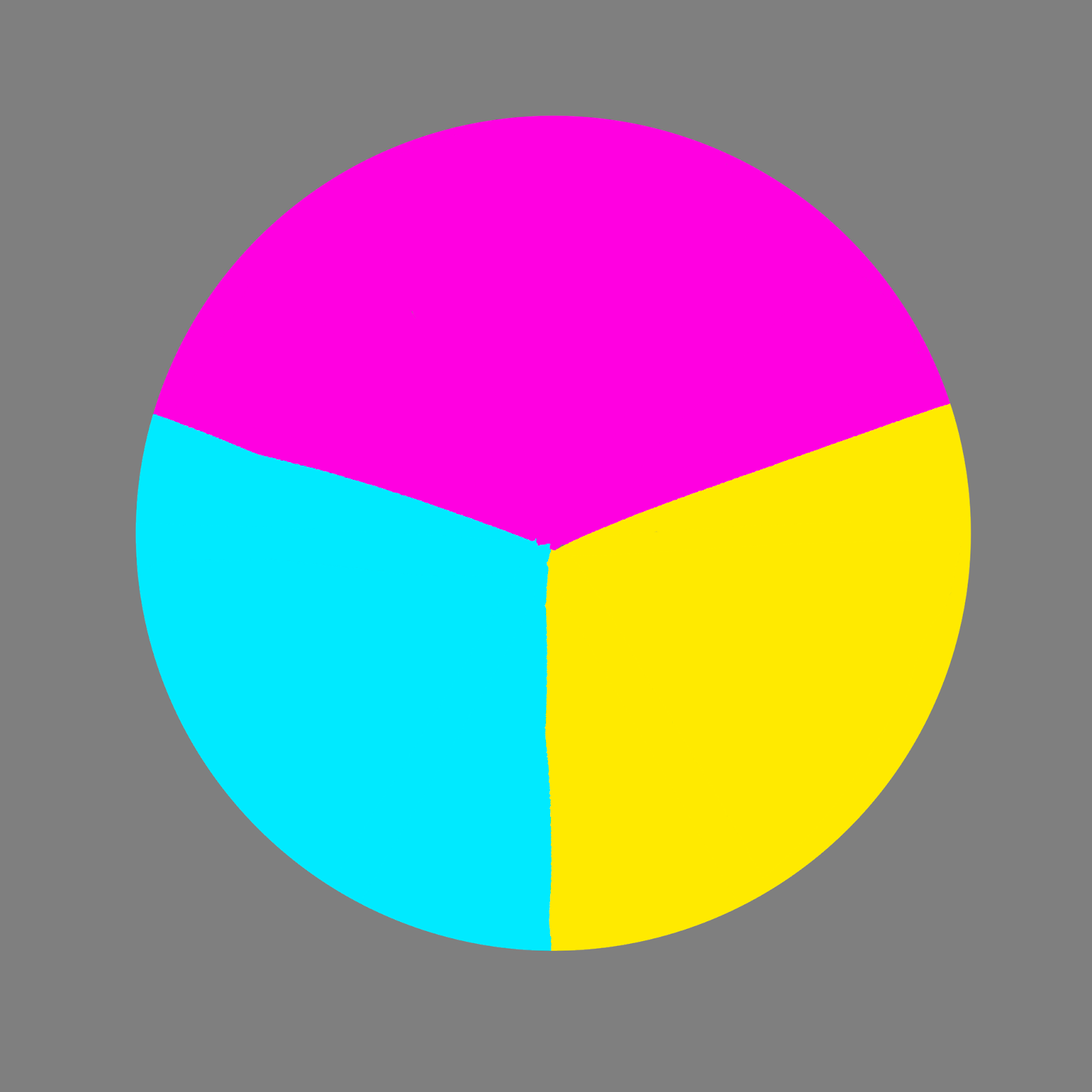
If we mix magenta and yellow, we get this pretty red-orange! Mixing cyan and yellow gives us a springy green, and mixing magenta and cyan gives us a rich purple.
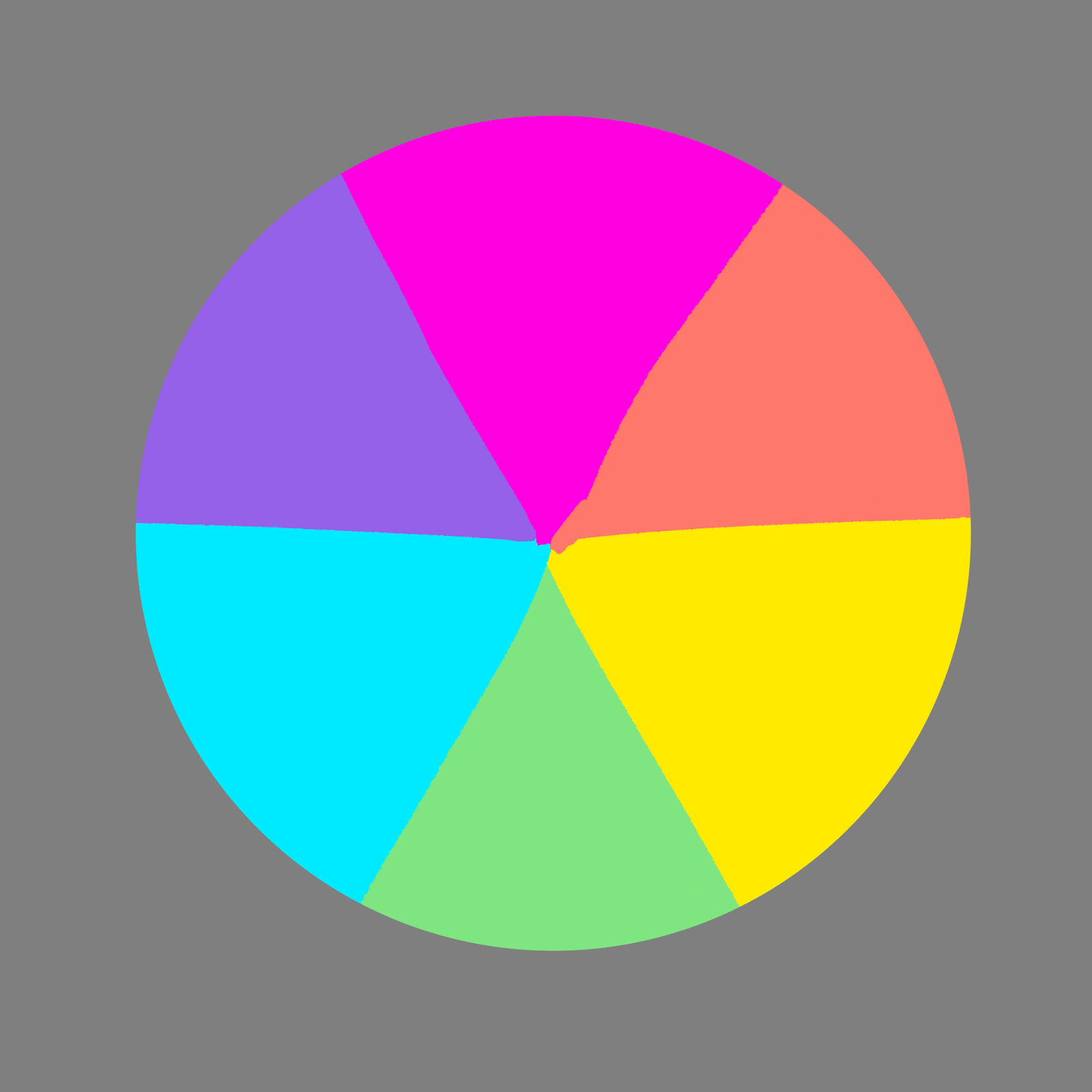
Then we can move on to tertiary colors. Mixing cyan and green gives us a light teal, mixing magenta and reddish-orange gives us pink, so on and so forth. This is typically when colors stop being mixed, but technically, you could go on to quaternary, quinary, senary, septenary, and on and on!
Now, we have the traditional color wheel!
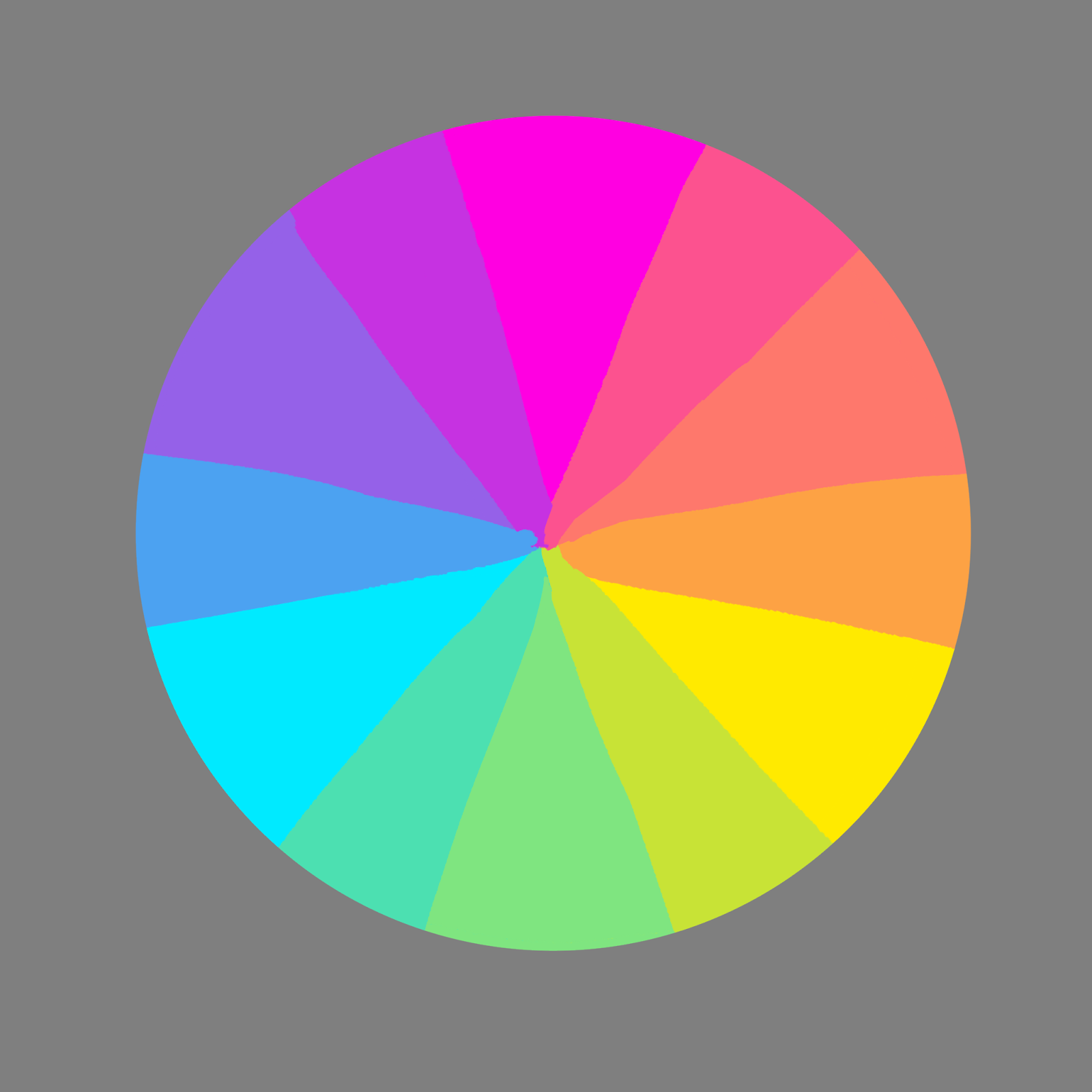
Now we’ve got a full color wheel to play around with! You can mix and match colors as you please, and test what color combinations look good and which don’t. This is called building a color palette. A color palette is a collection of colors that are put together, in order to be used in any form of art. Each palette you make will be different from the last. Colors are wild, and their rules are made to be broken!
However, to break the rules of color theory, you first have to know what the rules are. There are plenty of strategies to use when building a color palette that looks appealing. These strategies are called color schemes. I like to think of them as training wheels, the foundation for learning how to use the color wheel to its full extent. You’ll likely recognize the phrase “complementary colors.” That’s because complementary colors are a color scheme! We’ll be diving into complementary colors today, along with monochromatic, triadic, and analogous color schemes.
There are a couple of color schemes I’m going to be leaving out of this article for simplicity’s sake: the tetradic color scheme and the split-complementary color scheme. This is because they are both very similar to the complementary color scheme. Feel free to look up images of these color schemes to get a better feel for them!
First up, we have the monochromatic color scheme.
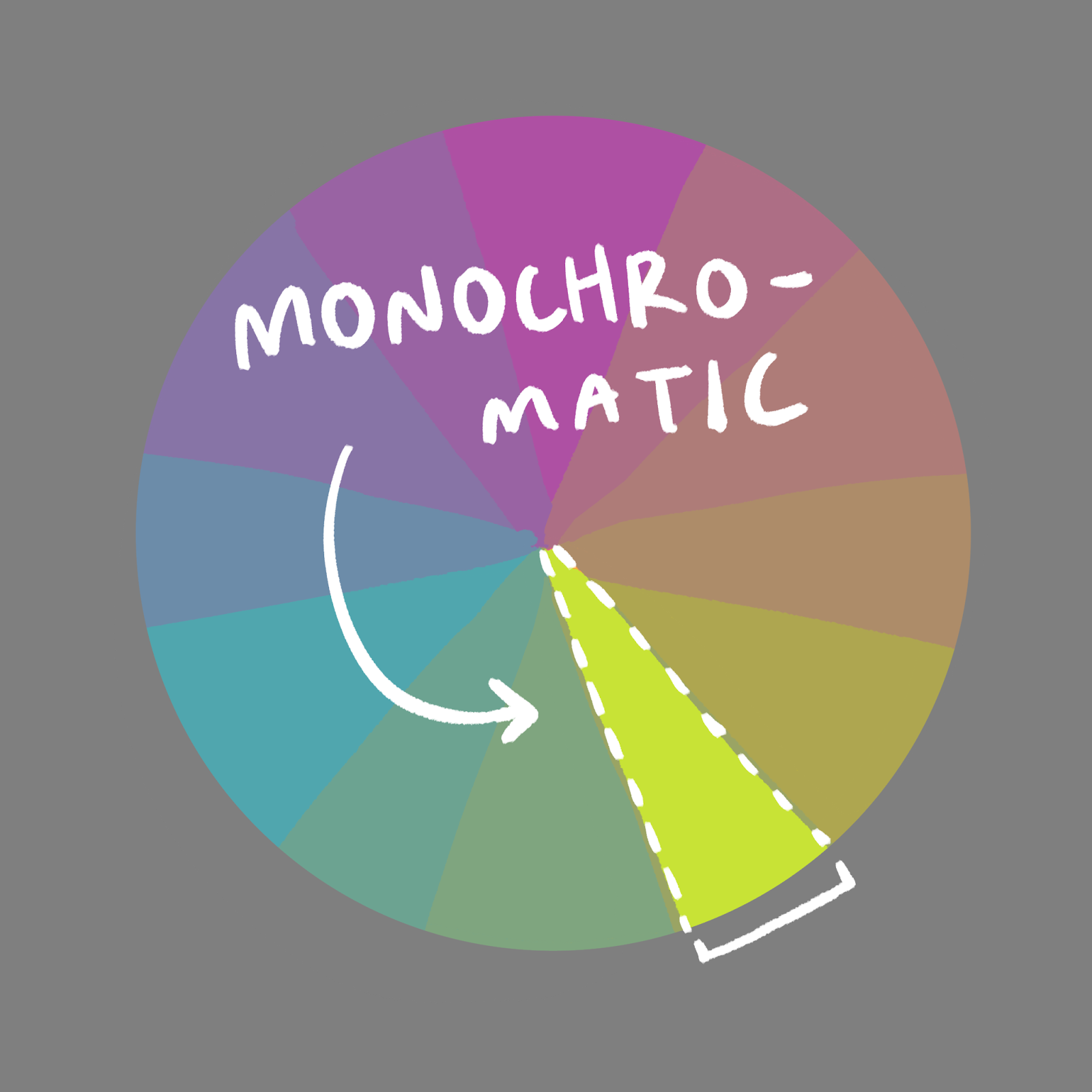
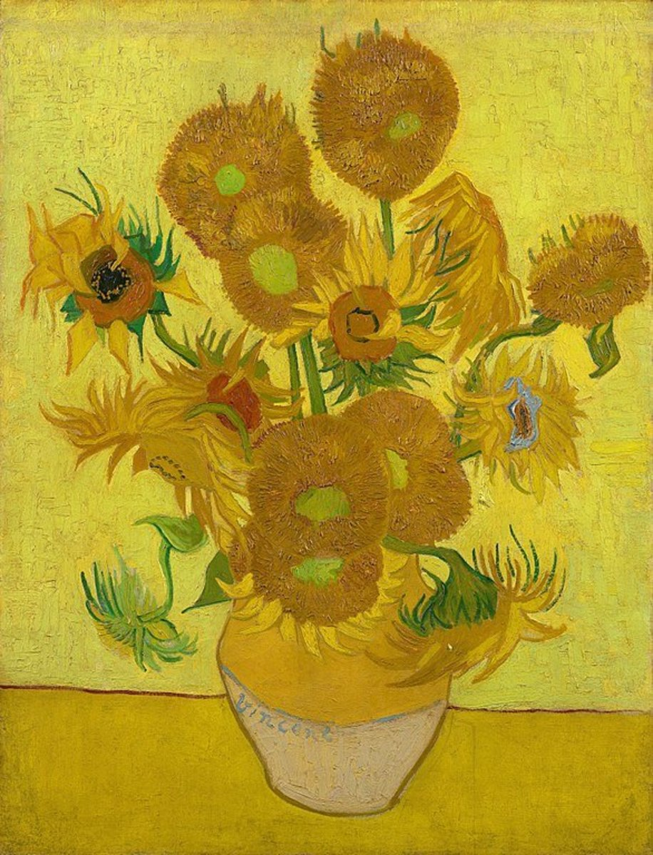
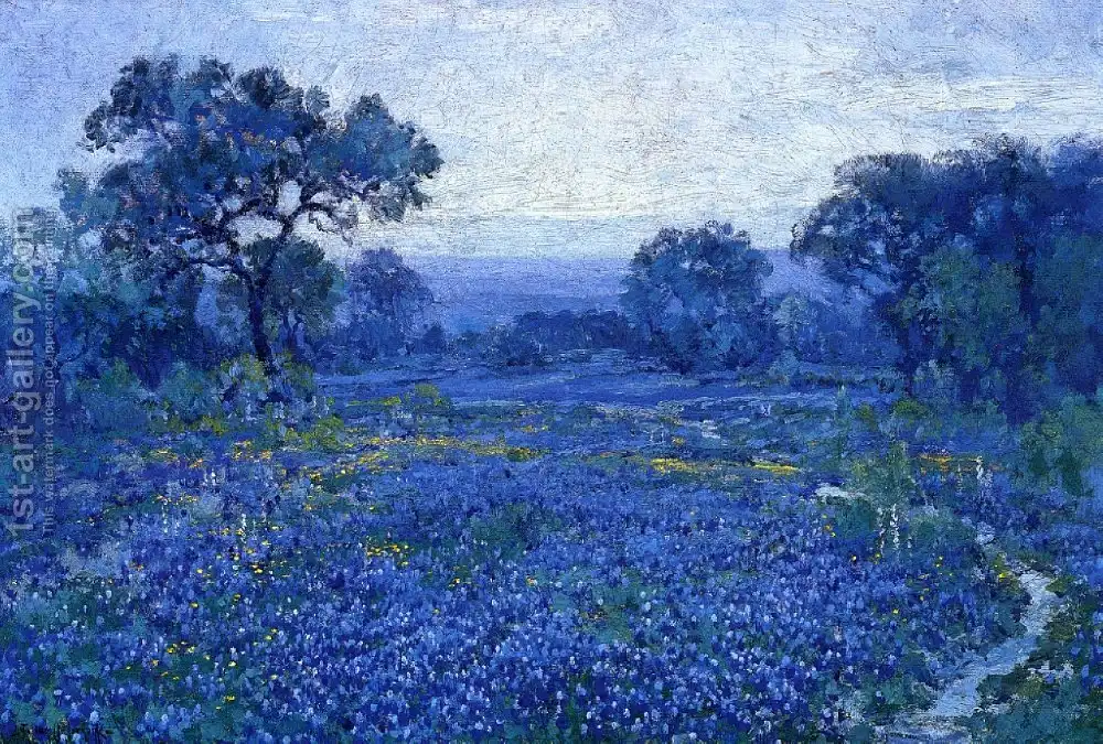
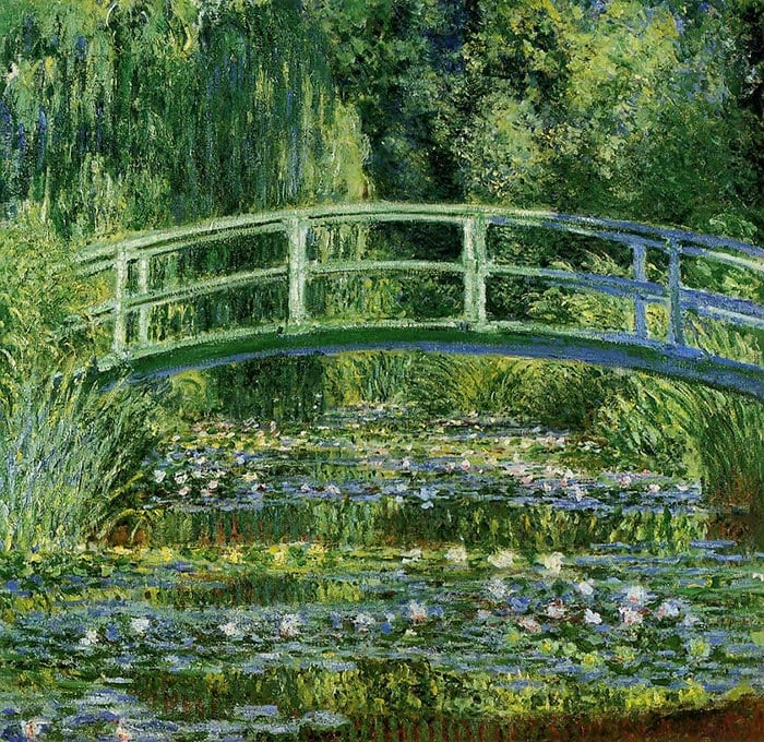
This color scheme focuses on one color of the color wheel. Monochromatic color palette builds can include many different values of the same color–for example, light blue, blue, and dark blue could be a simple monochromatic color palette. Here are some examples of monochromatic color palettes when used in art pieces:
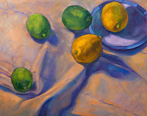
Next, we have everyone’s favorite color scheme: complementary!
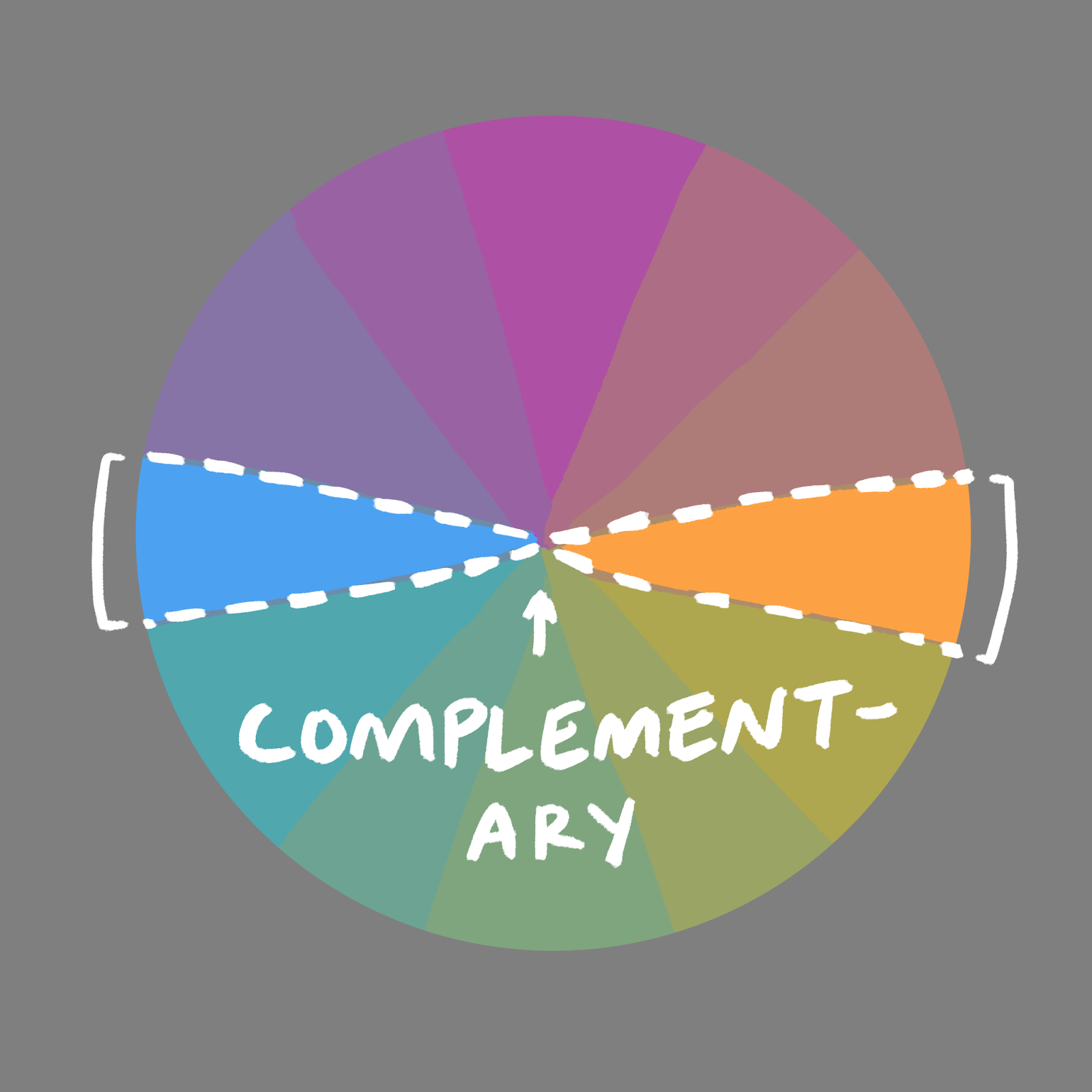
To build a color palette with this scheme, you take colors from opposite sides of the color palette. An example would be taking values and hues of red and placing them next to greens.
Even though this color scheme is common, that doesn’t make it any less effective. Placing complementary colors in your work will emphasize both colors in all the right ways, giving your art an appealing weight and flow.
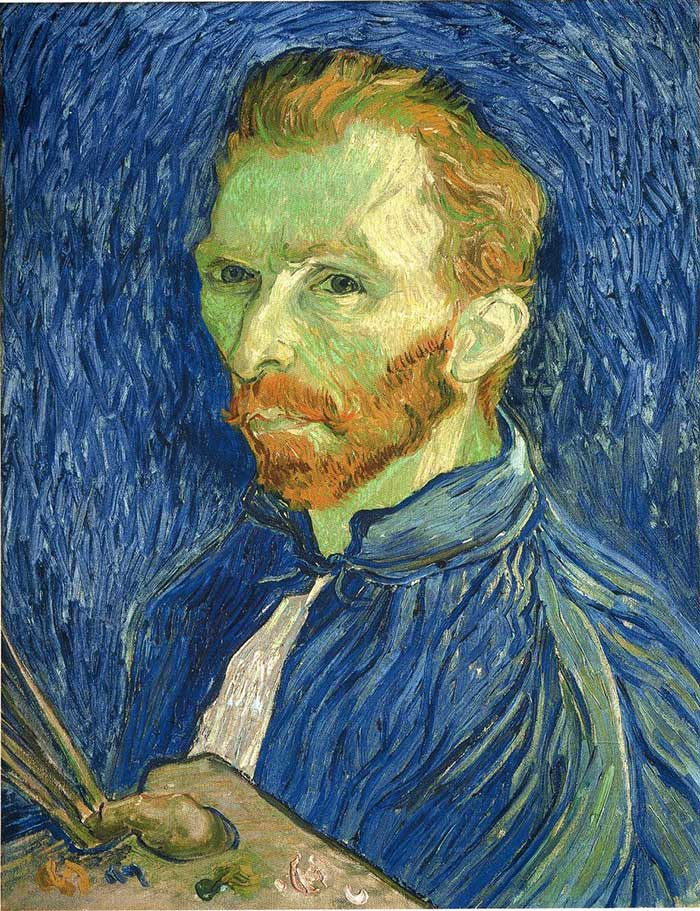
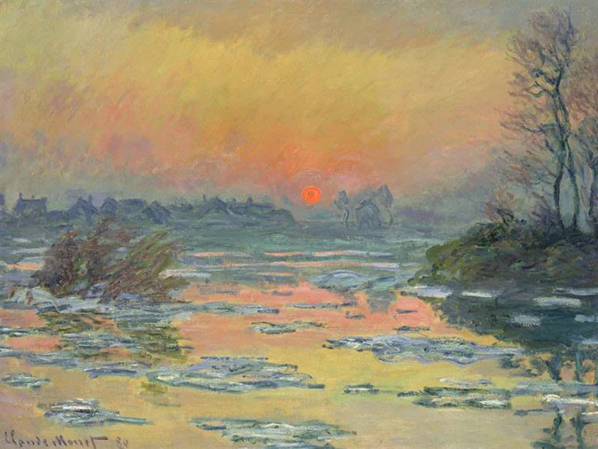
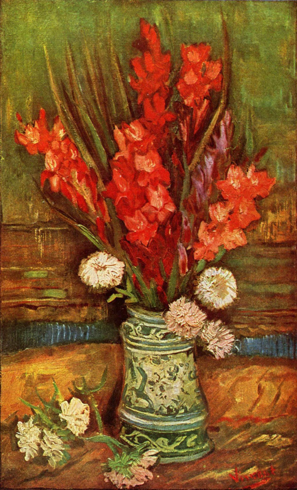
Here are examples of artwork with complementary colors:
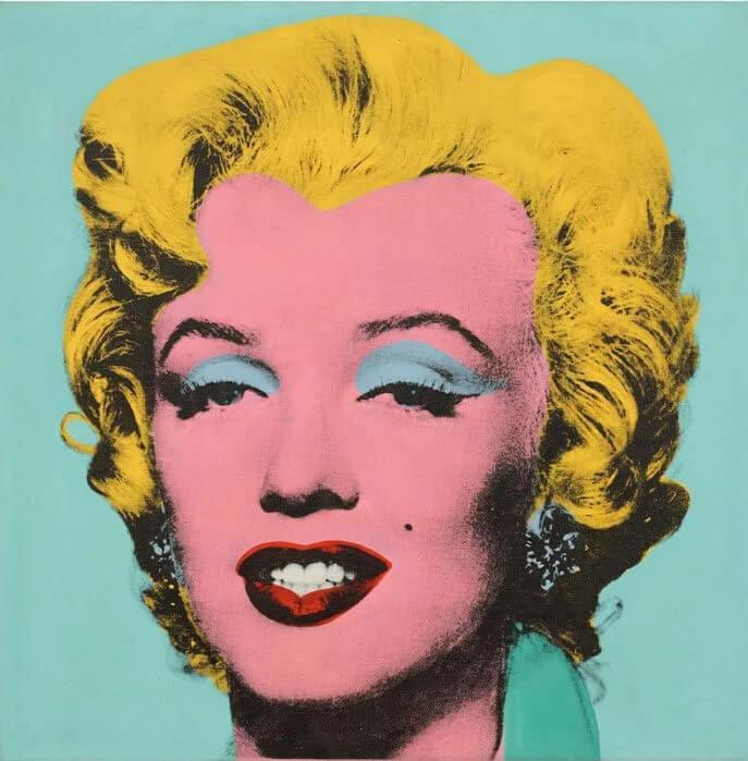
Third, we have the triadic color scheme.
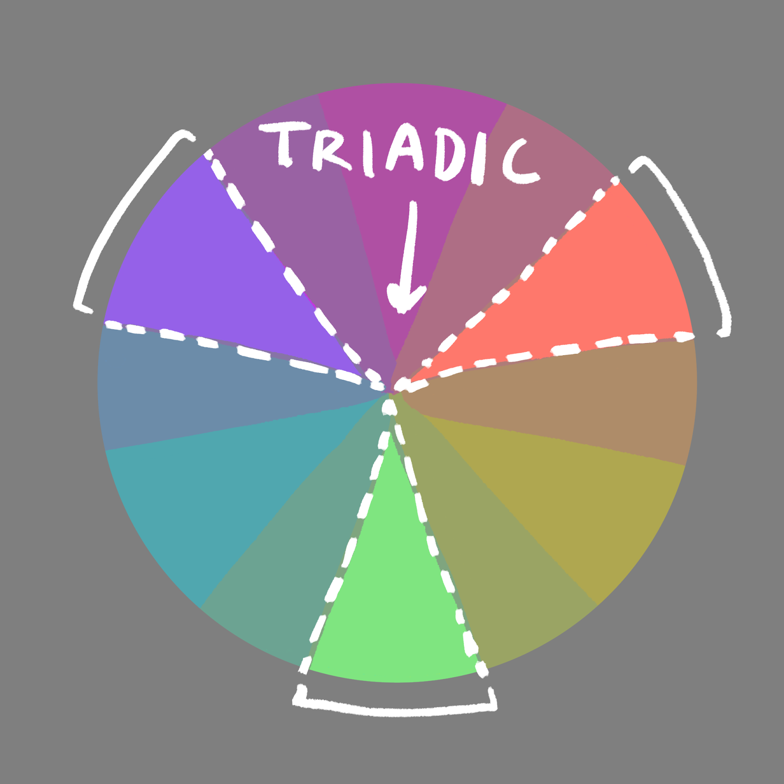
This is the complementary color scheme’s cousin, essentially–they have a lot in common. They include colors that are far away from each other that split the color wheel into a perfect ratio of two or three (corresponding to each color theory respectively).
Here are some examples of triadic color theory in action!
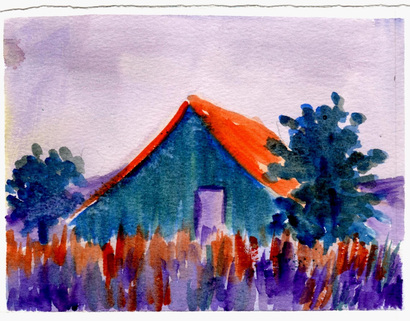
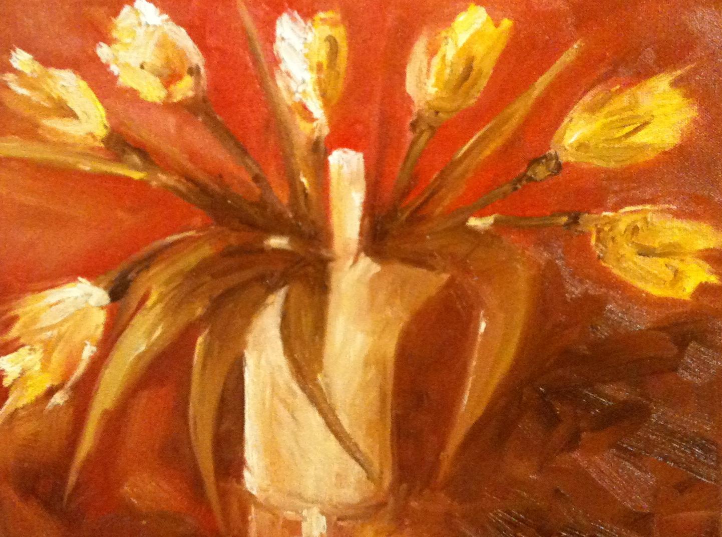
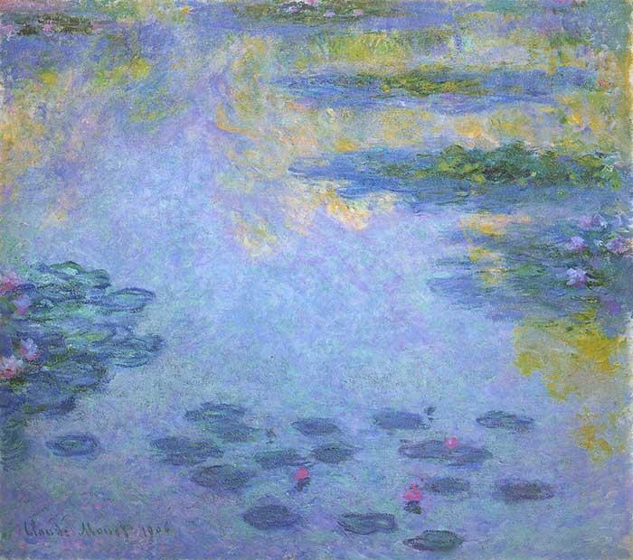
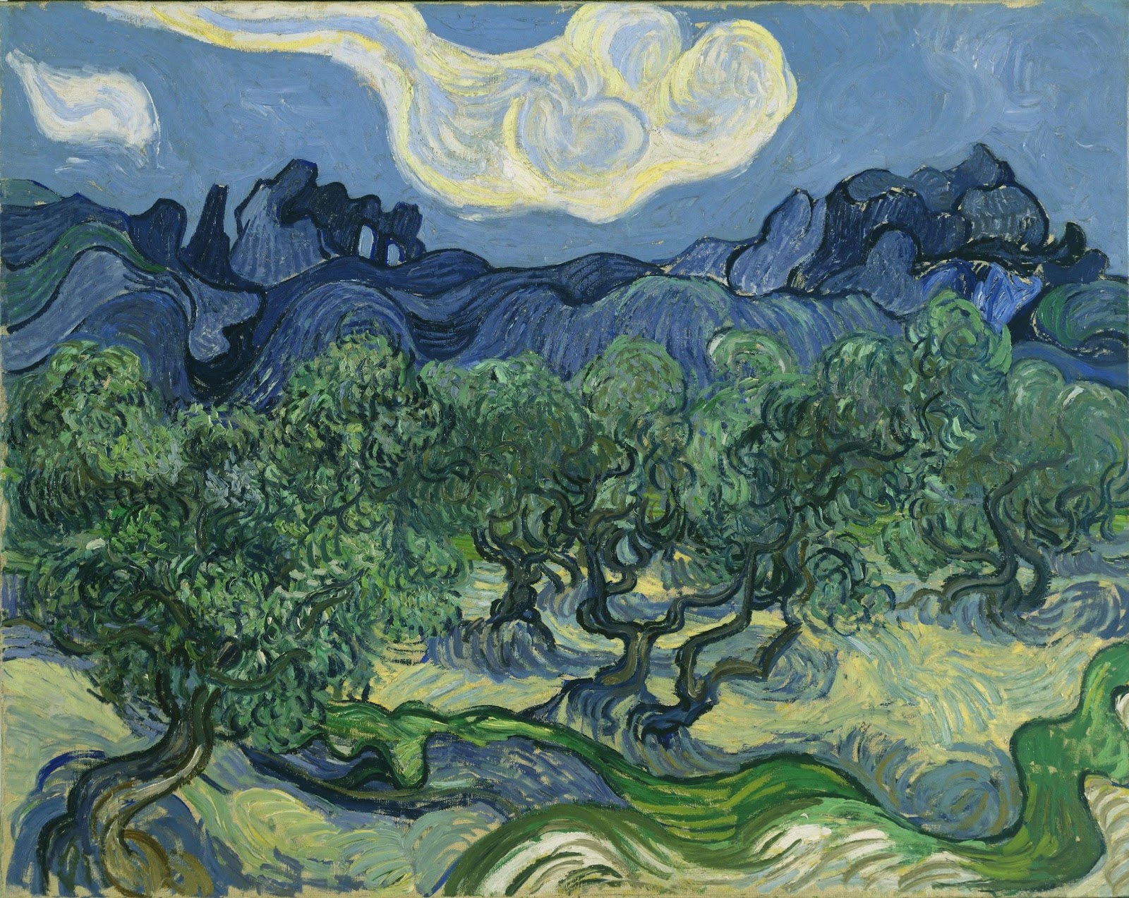
And finally, the analogous color scheme.
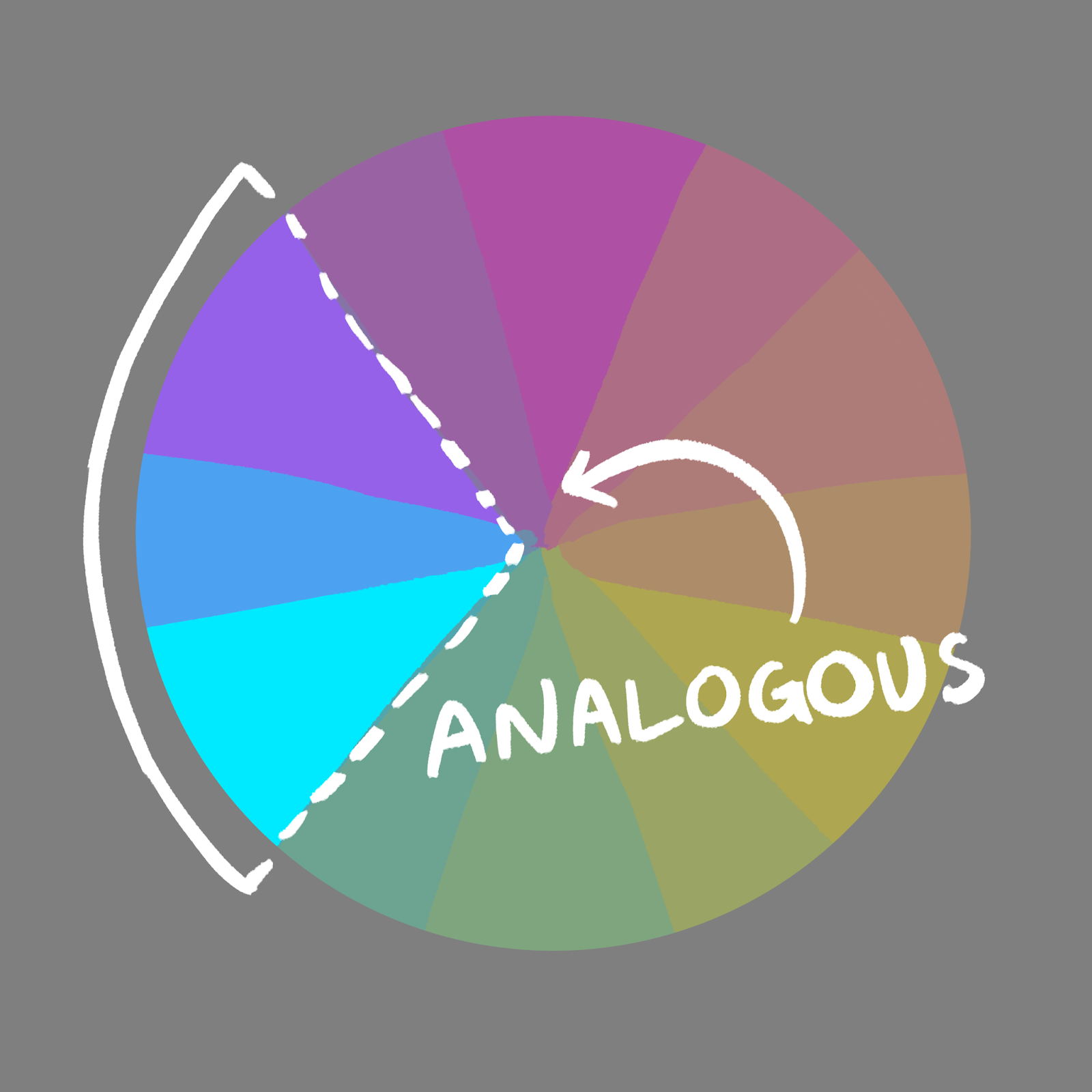
The analogous color scheme is similar to the monochromatic color scheme, except that it has a bit more range and flexibility. The analogous color scheme is basically a chunk of color taken out of the color wheel. It’s flexible and easy to use, because these chunks can be as big or small as you want! Typically, though, the chunks are about a third or fourth of the color wheel.
Here are some artworks that feature the analogous color scheme:
You made it to the end of the article! I congratulate you; that was a lot to read. Hopefully, you’ve now got a grasp on basic color theory, and you can move on to studying more complex aspects of art! I think a great place to begin would be those other two color schemes I told you about before.
If you’ve had enough of color schemes, I recommend you take a look at any one of these art theories:
Contrast
Composition
Texture
Hue
Value
This is just a handful, but it’s a good start. Feel free to come back to this article for reference at any time; a good artist practices a little every day, after all, and sometimes we need to review what we’ve forgotten over time.
Now, on to bigger and greater artworks!
No comments:
Post a Comment